- Feb 15, 2019
- 12 min
How enterprise brands are using hybrid headless CMSs
Magnolia in action
Take 12 minutes and a coffee break to discover how Magnolia can elevate your digital experience.
As brands turn to enterprise headless CMS solutions with the objective of maintaining a competitive advantage in the omnichannel era, a new kind of headless is emerging: a hybrid headless.
We've looked on this blog at what is a headless CMS. But what exactly is a hybrid headless, and how are brands utilizing these hybrid headless solutions?
What is a Hybrid Headless CMS?
Hybrid headless is a fancy name for a simple concept: a full CMS, with a full-featured UX, that also serves its content via REST API, and manages clean, presentation-independent content.
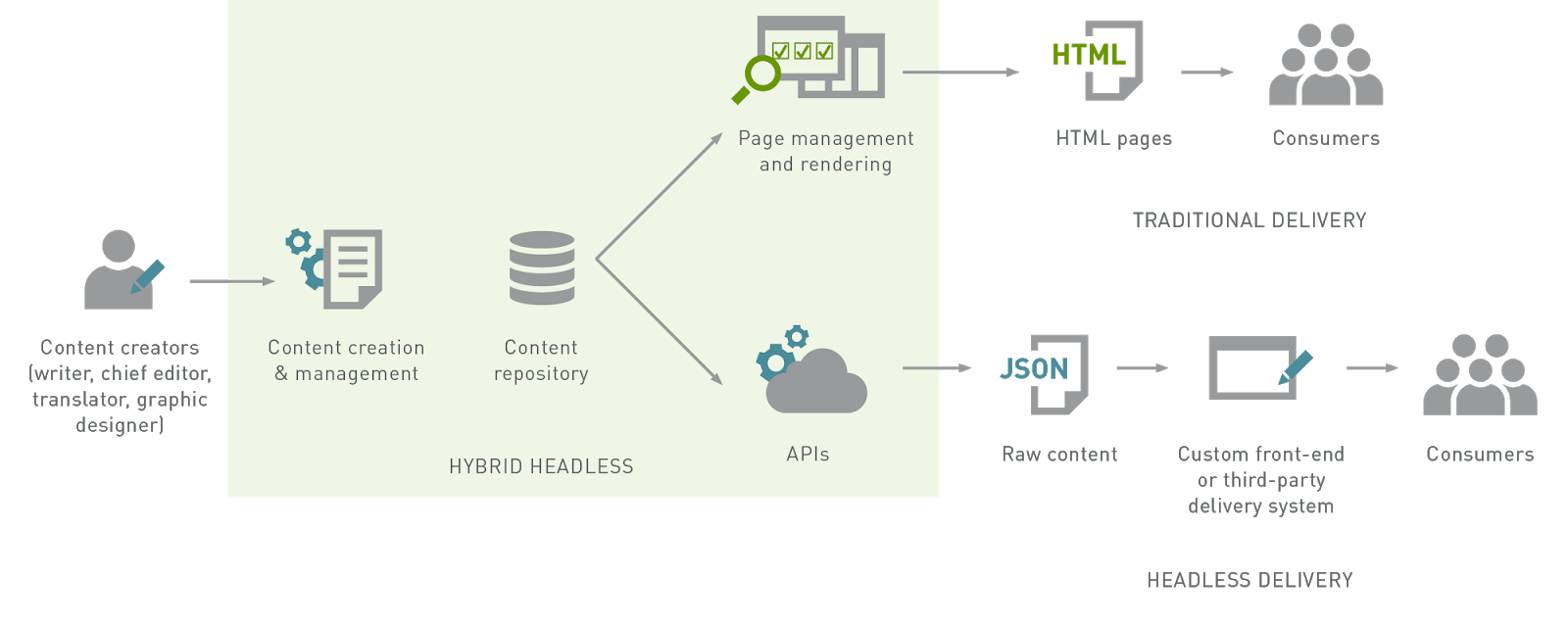
It is similar to the headless approach, which is also great for many reasons. For one, in a headless approach, it decouples the content from the front-end presentation layer which creates a heck of a lot more room to innovate and experiment with different mobile apps and develop your own front-end presentation layer. Plus, you can get started with your innovations instantly.
However, the headless CMS approach does have its limitations which could bog your project down a little along the way.
These are the two key issues for me:
Marketers and content creators (users who aren't developers) cannot do as much.
A headless CMS simply doesn't cover many of the common content management requirements.
But just for the record, this is not a “headless CMS is bad” article. I just want to set the stage for hybrid headless so you can become familiar with some of the benefits of this approach, and see how brands have embraced this approach to their full advantage.
A hybrid headless has the UX of a full CMS
As I mentioned, a hybrid headless CMS comes with a full-featured UX that empowers non-developers, such as marketers and content creators, to perform key website and content management tasks themselves. Of course, all CMS offerings are different, but here are two tools that are shared by most full CMSes:
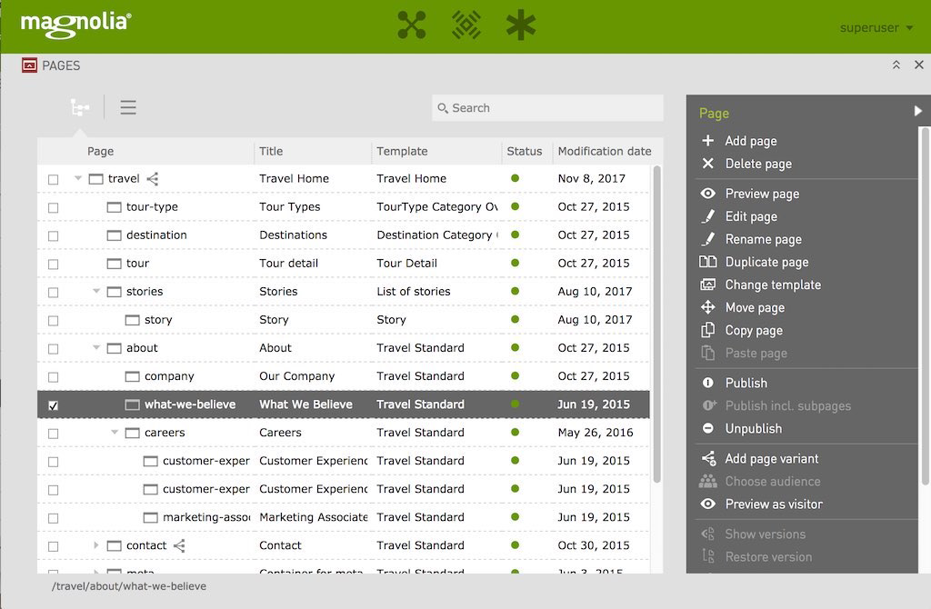
The Page Tree (AKA Site Map or Content Tree)
The Page Tree allows you to see and manipulate the structure of your entire project, which is typically represented as a hierarchy with the homepage at the top. Here’s how the page tree is presented to the user inside Magnolia, an open source headless CMS.
The Page Editor (AKA WYSIWYG editor, Content Editor, Post Editor)
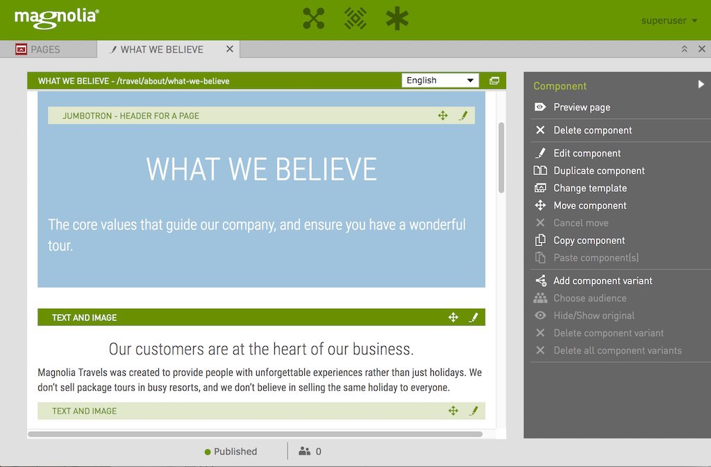
With a page editor, you can build and edit a page by choosing a template, modify its layout via drag-and-drop, and populate your page with the content stored centrally in your CMS. While it's still called a "page editor", a better term in this day and age is "experience editor" - it's where you can really build an experience, not just enter content data in a form.
Here’s how Magnolia’s page editor is presented to the user:
The four hybrid headless techniques
To successfully deliver your experience via hybrid headless, there are four techniques that you need to be familiar with. In this section, we share what these techniques are and explain how these techniques are put into practice on Magnolia, our headless hybrid offering.
1. Full CMS and REST API
This technique involves creating clean, presentation-independent content which is served through REST endpoints. The content is managed via the page tree editor.
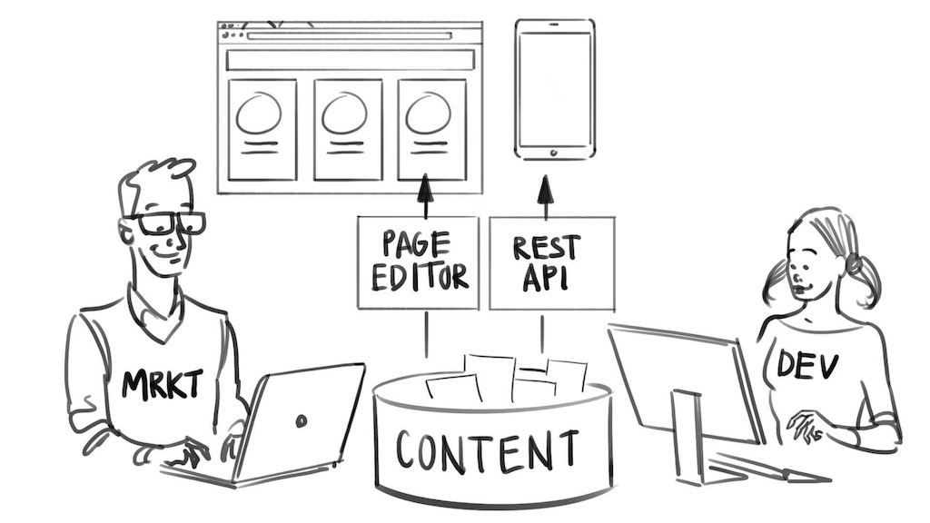
Driven by the popularity of mobile apps, front-end JavaScript frameworks, and SOA (Service Orientated Architecture), many companies already use this fundamental technique. Marketers and content creators are self-sufficient and have full freedom to create and manage the website. Meanwhile, with the REST API, developers can create mobile and front-end apps in their programming languages and frameworks of choice - or pipe the content through existing delivery pipelines or third-party systems.
Is a Headless CMS Right for Your Enterprise?
Download this free white paper to make the right choice for your business
This technique in practice on Magnolia
In Magnolia, content apps provide a form-based editor for structured (presentation-independent) content. Content apps are equivalent to the editors in a pure headless CMS.
The Stories app provides a rich "medium-esque" editor for long-form content, giving the author freedom to create a full story instead of just filling in a form. Content is stored in clean blocks for retrieval as JSON via REST.
Content can be easily retrieved as JSON. Developers can quickly configure endpoints in a few lines of YAML. Access can be controlled through a full-featured role-based security system.
2. Page fragments as JSON
With this technique, marketers use the page editor to curate a fragment of a page with content and specific templates. Developers pull just the pure content of that fragment, as JSON, and render it in their app.
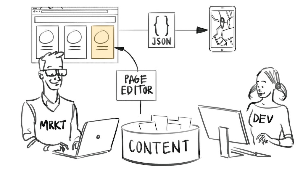
The benefit of this approach is that marketers can arrange not just their website, but also experiences that are used in apps and other systems. And they can do it in familiar tools, potentially including the ability to use the personalization and targeting features of the CMS.
Since developers pull content directly as JSON, they can use it however they want in a headless fashion. Developers have control over the actual display of the content, so it might look different than in the page editor.
This technique in practice on Magnolia
There are two ways to get the content of a page fragment via JSON on Magnolia:
The REST API can return a fragment from within a page
- a complete page
- or a collection of pages.
Render variations: Any template can provide multiple rendering variations
- one of those can return JSON. A developer must code the JSON response using standard templating practices. The jsonfn library can be used to return the full content in one line of code. This approach can be used if the format of the REST API response is not the exact one you require.
3. Page fragments as HTML
As above, marketers use the page editor to curate a fragment of a page with content and specific templates. The developer configures another system or app to pull that fragment, rendered by the CMS as HTML. This is similar to the previous technique but delivers rendered HTML instead of JSON.
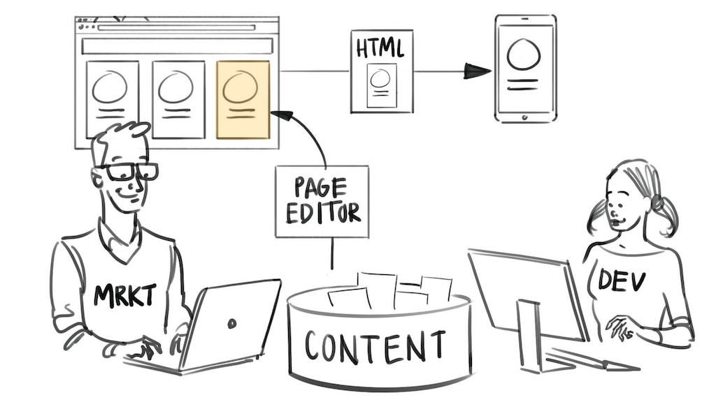
"Wait, wait, what about a REST API? What about presentation-independent content?" you say. You caught me! It's relevant in this list because it's still about another app or delivery system grabbing some content from the CMS.
As before, the marketer creates experiences that are used in apps and other systems, with familiar tools. In this technique, since rendered HTML is delivered, the marketer also has a WYSIWYG authoring experience with live preview of the content.
This technique in practice on Magnolia
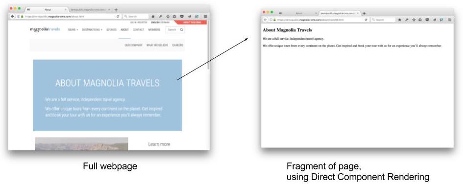
In Magnolia, a feature called "Direct Component Rendering" gives easy access to any fragment of a page simply by including the "address" of the fragment in the URL.
For example, to access a fragment on this page: http://demopublic.magnolia-cms.com/about.html
You can simply add "/main/00" to grab the first element of the "main" area. Try:
4. Build front-end apps
Developers design their front-end apps with a modern component-based architecture. Marketers use the page editor to manage the content of, configure, and assemble front-end javascript apps (aka SPA).
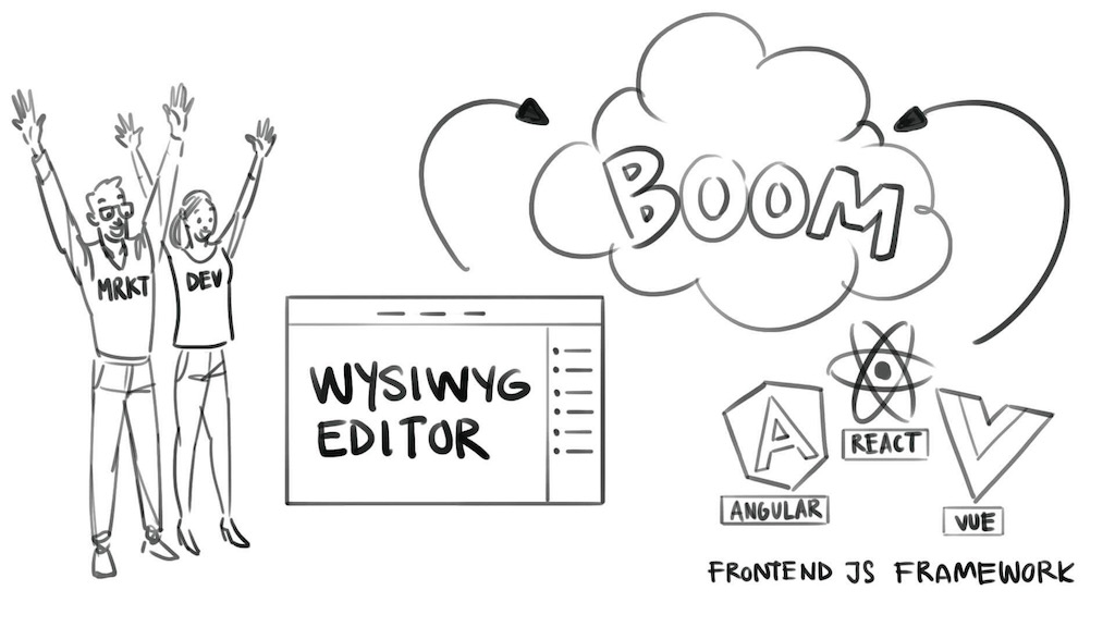
The first three techniques can all be used to manage the content of front-end apps (among other things). This one goes further.
With this approach, marketers can actually build a front-end app - in the same way that they are used to building a web page today.
This is huge since there is such momentum with frameworks like React, Angular and Vue. We have a lot of customers who love these frameworks but are struggling with how to give their non-technical staff a way to manage them - so that the developers are not always burdened making tweaks and doing new releases whenever there is a change required.
In this technique, the "page editor" becomes an app editor. Marketing teams can build the apps that they need in a WYSIWYG environment and work with a live preview of the end-user's experience.
The javascript frameworks all support this technique - but developers must take some care to create such dynamic apps that can be changed on-the-fly. The key difference is that instead of the app "hard-coding" exactly which components are nested within a parent component, it rather specifies a list of the components it could contain. When the app initializes, it loads a JSON configuration file that defines which components should actually be instantiated at each location.
There are already some nice libraries out there that make this easier, such as React Habitat from Deloitte.
This technique in practice on Magnolia
The Magnolia page editor uses simple HTML comments on the page to configure and indicate where the WYSIWYG editing widgets should be displayed. These invisible comment blocks provide information such as which areas of the page are editable, and which components can be inserted in that area.
With a little javascript code, these HTML comments can just as easily be inserted in the HTML generated by front-end javascript frameworks. This makes it easy to make front-end apps editable in Magnolia. I assume a similar mechanism is used in other CMS page editors, and so that the general approach will be do-able in other CMS as well.
How are brands using hybrid headless content management systems?
To provide innovative and omnichannel experiences, industry-leading enterprise brands leverage Magnolia CMS as a hybrid headless CMS. Below, we’ve outlined exactly how these companies use Magnolia CMS.
1. An international news publisher managing journalists, content, and publication
A leading Middle Eastern news website which attracts up to 70 million page views a month wanted to work with a platform that is secure, could handle heavy traffic, and provide sufficient UX for their team of 40 full-time journalists that adds around 200 new articles to the site every day.
Their old platform was subject to politically motivated hacking and denial of service attacks (DDoS) on a daily basis and struggled to keep up with the heavy traffic usage.
On applying the building your own front-end technique, the news organization was able to develop their own dashboard that their journalists could use to publish their articles. The purpose-built frontend app featured a custom workflow that was tailored to the exact needs to their dynamic, non-linear editorial process. This ensures that whenever a new story emerges, it instantly gets directed to all the relevant teams for additions, translations, and checks.
And thanks to the API-driven environment of Magnolia’s hybrid headless offering, the news company were able to deliver a full range of multimedia content. Magnolia’s open-suite approach provided high connectability allowing them to integrate with various third-party systems with ease.
Another news organization, one of Europe’s biggest soccer news site, also benefited from adopting Magnolia’s hybrid headless. But they went for a different approach.
To help them meet their heavy traffic demands, they used Magnolia’s Stories app to customize an editing experience that came in line with the company’s editors preferred method to produce, curate, and publish content in the fastest way possible. This enabled editors to have full control of their experience and deliver content to independent websites and mobile front-ends using their own display system to render JSON data. This was more powerful, and quicker than just filling out forms.
2. A car rental company providing omnichannel customer experiences
A UK-based car rental service, that has over 10,000 rental locations spread across approximately 175 countries and serves under multiple brands, wanted to move away from their old federated business model in the EMEA region to switch to a more centralized approach that fostered integration, collaboration, and operational efficiency. As well as provide a comprehensive multi-channel experience.
Their old system ran on numerous bespoke CMS solutions which became cumbersome to manage and needed technical assistance. It took up a lot of the IT department’s time to effectively maintain the system.
The company chose Magnolia’s hybrid headless offering due to its ease of use, scalability, and extensibility. Another factor that solidified Magnolia as the number one choice was its use of open APIs and data standards that provided opportunities for rich integration and delivering customized content across multiple touchpoints.
During the migration process, Magnolia’s modular architecture allowed the team to quickly implement important new functionalities via using existing modules.
The end result provided the rental firm a fresh website supported by a platform that allowed them to deliver unique experiences across different devices and markets.
3. A retailer offering personalized in-store experiences
An Italian-based retailer wanted to increase their customer engagement by providing an interactive digital experience in-store. While personalized online shopping has taken the world by storm, the retailer wanted to provide this personalized experience to their customers in-store. To achieve this, they knew they had to integrate with other mobile channels.
Magnolia’s built-in data tracking and analytics provided the retailer the ability to actively learn about their customers and automatically deliver personalized content that was relevant to them on their mobile device. This could range from e-coupons, special offers, and rewards.
In addition to mobile devices, the retailer utilized digital information displays throughout the store to deliver content related to branding, merchandising, promotions and entertaining customers. This all enhanced the in-store shopping experience.
As a result of implementing this campaign, Magnolia was able to increase their customer loyalty, and offer a personalized customer experience, both in-store and online.
4. An eCommerce brand delivering multi-lingual content and commerce
A leading clothing company, one of the largest fashion houses with more than 2,300 stores, heavily relies on their eCommerce sites for one of its brands. To help the brand expand its global outreach, they need to have an eCommerce system that could deliver a multi-lingual and multi-channel experience.
But in order to deliver this experience seamlessly, they needed to minimize the risks when the content was uploaded and, more importantly, they needed to reduce the workload of their dedicated team to support many multi-language sites.
Magnolia’s full-featured easy-to-use UX gave little room for mistakes during content uploading. Plus, its built-in multi-language features let you manage multiple versions of the same site in different languages and you can translate directly in the Pages App and content with integration into publishing workflow.
When the clothing company moved to Magnolia’s hybrid headless offering, they saw positive results in a matter of days of launching their site and gained a significant eCommerce turnover.
Hybrid headless: the best of both worlds
Over the past 15 years, the pendulum has swung back and forth in favor of strict separation between content and presentation. At one extreme: only entering content in database-like forms is allowed, putting a wall of separation between authors and the end-user experience. At the other: all content entry in-place in a WYSIWYG editor with the attendant risks of breaking the design.
But now I see a nice opportunity with the hybrid headless approach to become more subtle, less extreme and take the aspects from both which really help people get their jobs done.

