- Jul 29, 2022
- 7 min
Magnolia at Slimming World: A hybrid approach to menus
Magnolia in action
Take 12 minutes and a coffee break to discover how Magnolia can elevate your digital experience.
Slimming World has used Magnolia for the first time as part of an ongoing project to modernise one of our longest-standing web properties, “Our World”. Our World is a website specifically tailored to Slimming World Consultants and is available separately to the sites for the general public. As such, the content tends to be long-form and highly authored, requiring flexible, configurable components. However, as part of the redesign, it also came to light that authors would prefer only limited control over certain areas of the site, resulting in a need for pre-defined content models and dynamic content.
Ultimately, when it came time to develop the mega menus for our top-level navigation, it fell to us as front-end developers to satisfy both needs. So, if you ever find yourself in a similar position or think you may benefit from a hybrid approach (authored and dynamic content) to content delivery, we hope this blog post will be of assistance.
Read on for a technical exploration into how we approached the problem and the tools and techniques within Magnolia we used to achieve our goal.
Authored menus: flexibility and focus
For the majority of our menus, we knew we wanted to give authors complete control over content and enable them to flexibly change the look and feel. This meant working closely with the design team since a significant amount of Our World content is tied to time-sensitive campaigns with continually refreshing visuals. The initial UX had examples of "columns" of content in various widths and configurations for supporting imagery that we needed to componentize.
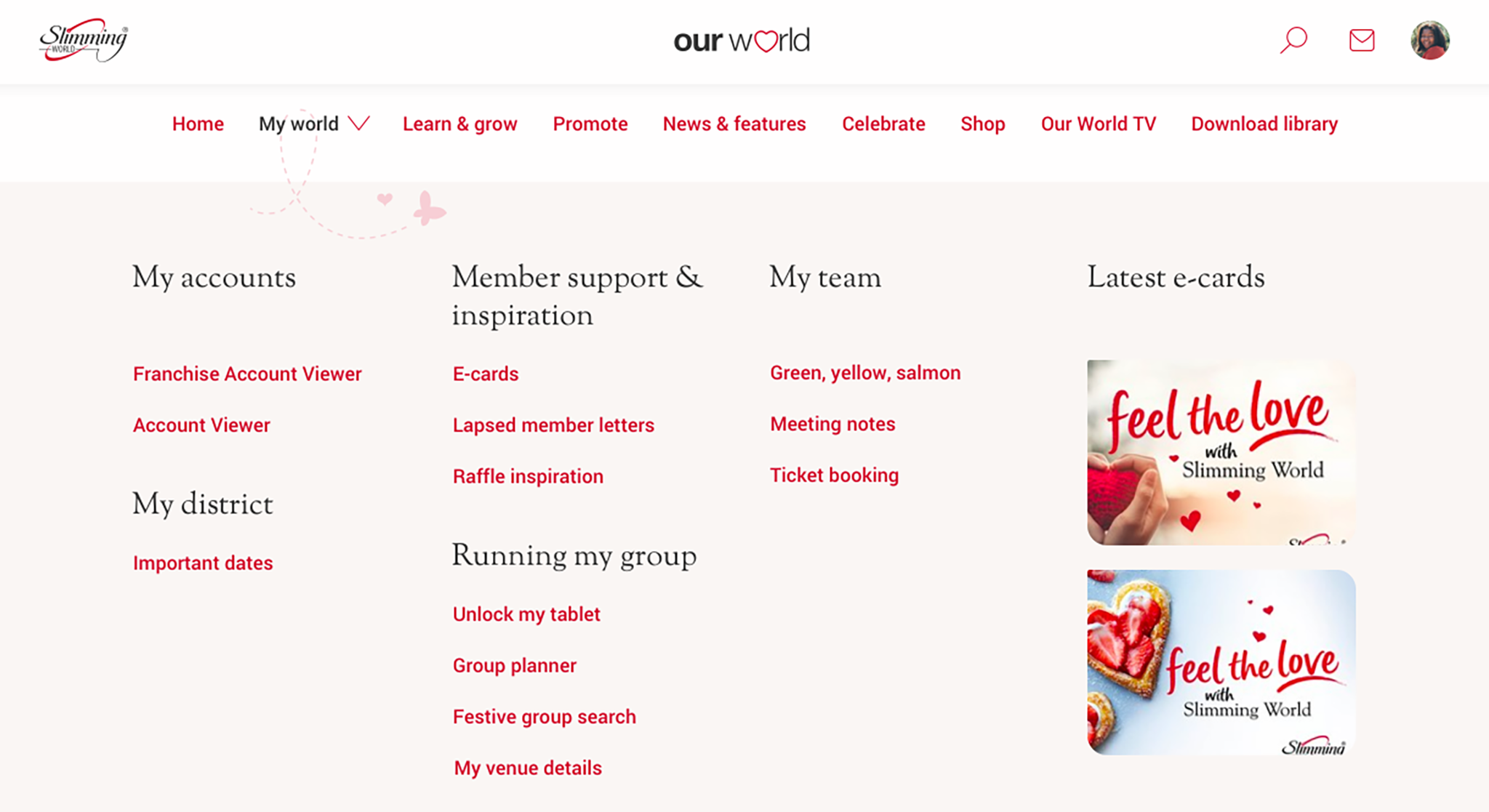
After several sessions working through these concepts, we settled on a "column" component with options for widths (defined in relative units to remain responsive) which would then contain one or more "link group" child components.
These groups could contain titles, links, and images and would remain responsive within their columns. Since the links were organised in a Magnolia multi-field, and the groups and columns were part of the component tree, content could be easily defined and rearranged using Magnolia’s visual editor.
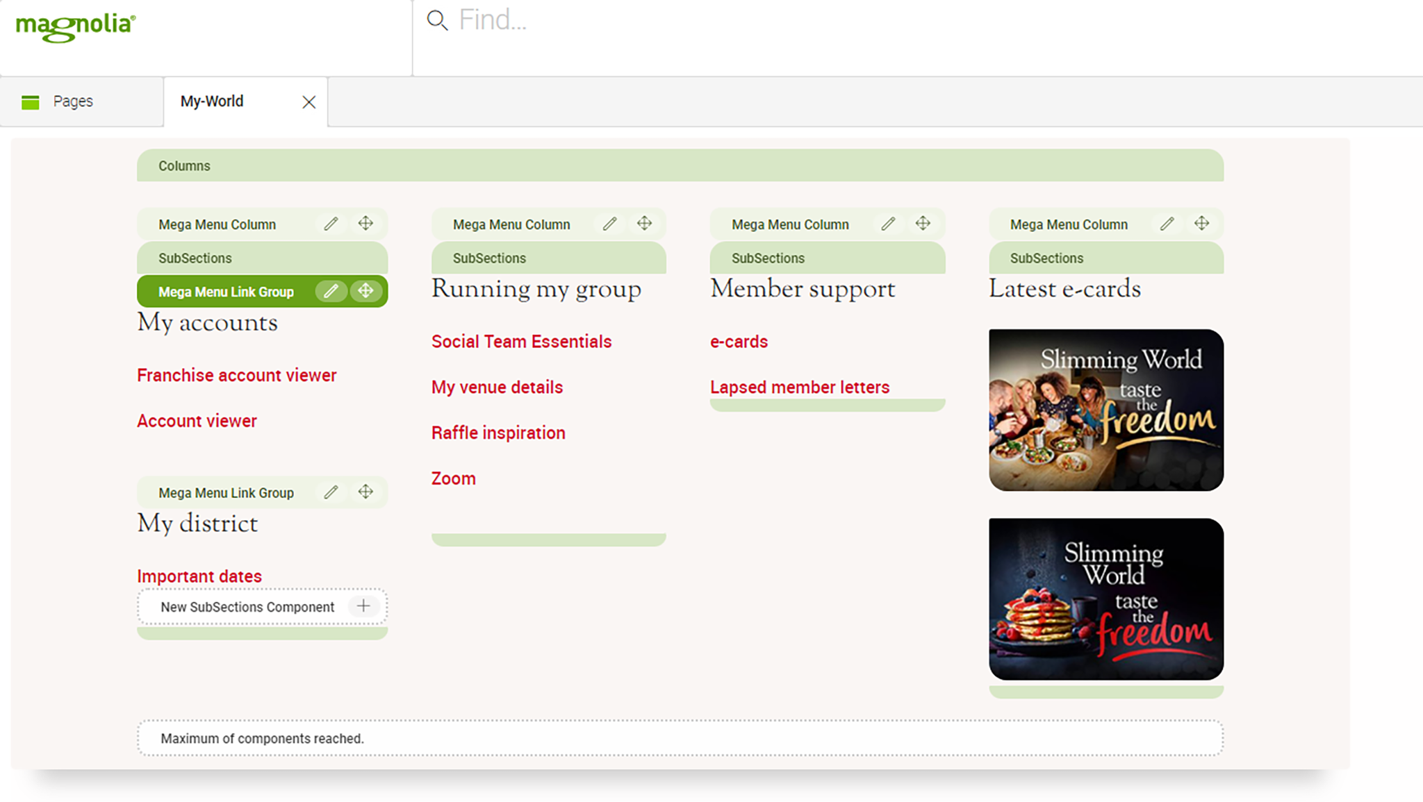
But how best to represent these menus in Magnolia?
Our existing navigation section was created as a shared FTL file, included as part of the header area in each of our content templates. This meant we could define it once and have changes reflected automatically across the site.
However, when we started developing the mega menu system, one of the key requirements was our authors’ desire to work on these menus in isolation. To allow them to keep using the editing tools that they were familiar with, we decided to split each mega menu into separate entries in the Pages App – listed under a single "navigation" folder.
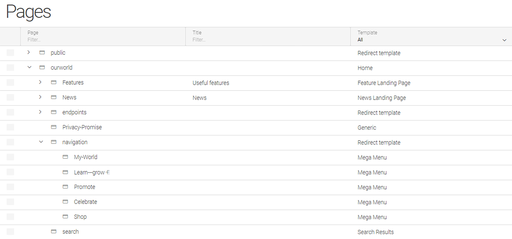
These “pages” would use a new "mega menu" template type with associated components and scripts. While this solution was met with satisfaction from our authors, we still needed to integrate these disparate menus into the site template. Luckily, we discovered that Magnolia's area definitions provided the default template script for listing components as part of a list. From this, we were able to deduce how to load our mega menu "pages" as embedded components using the [@cms.component content=component /] directive.
However, there was one last piece to the puzzle on having the menus individually editable whilst remaining embedded as part of the wider template:differentiating between editing a menu directly and editing it as part of a page.
Usually, we would use the isEditMode helper method of cmsfn to provide such tweaks to the author experience but, in this case, it would’ve simply have returned true for both scenarios. Instead, we looked into what information was available as part of Magnolia’s rendering context objects and soon discovered the mainContentNode property.
Knowing the targeted node quickly allowed us to determine when the editor was being loaded for the mega menu directly (the node's template type was "MegaMenu") or as part of a page (the node’s template type would be something higher level, like “News” or “Feature”). This meant we could continue to act on the menu as a complete “page” by including supporting html, body, and link tags – but only when editing in isolation.
Dynamic menus: endpoints to the rescue
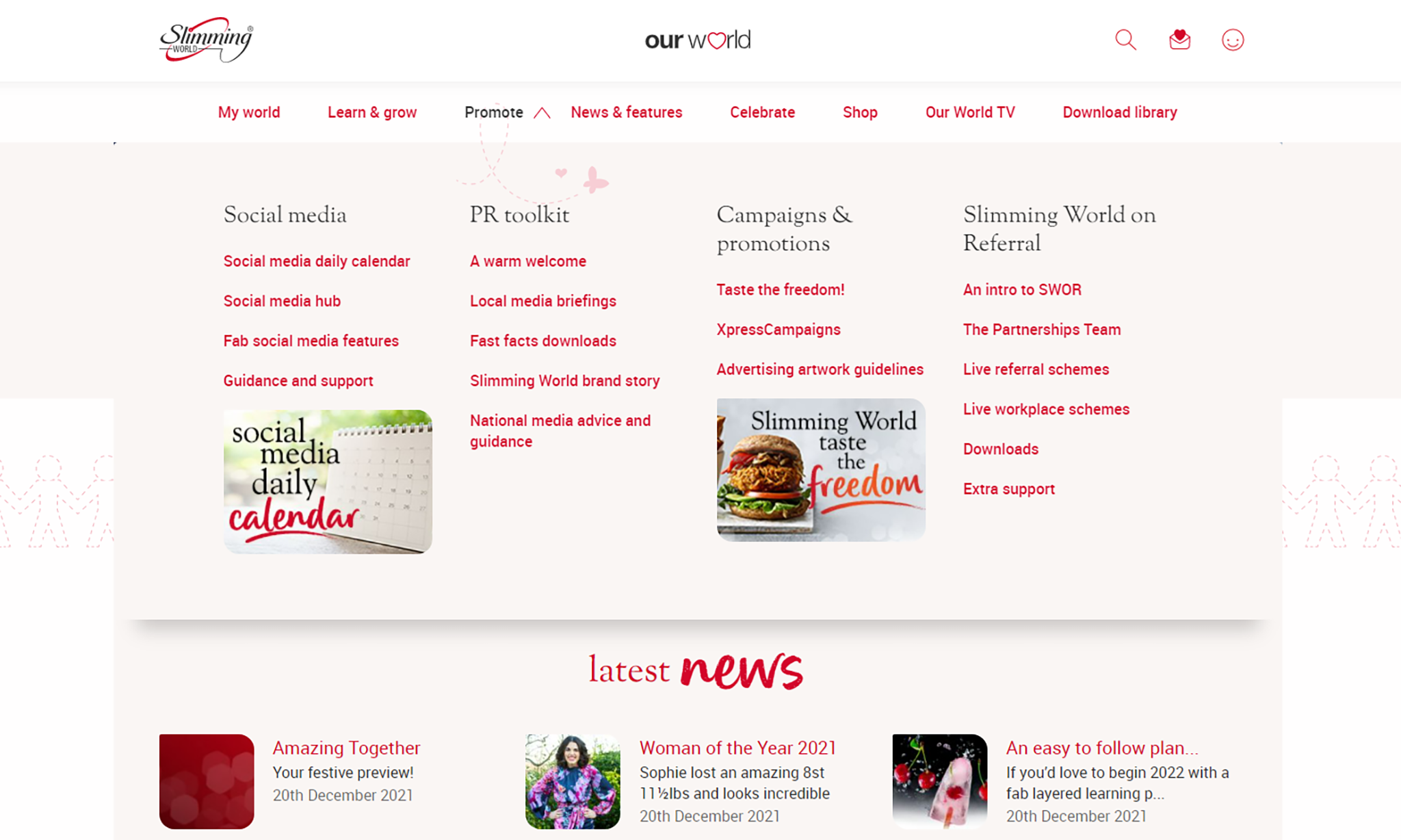
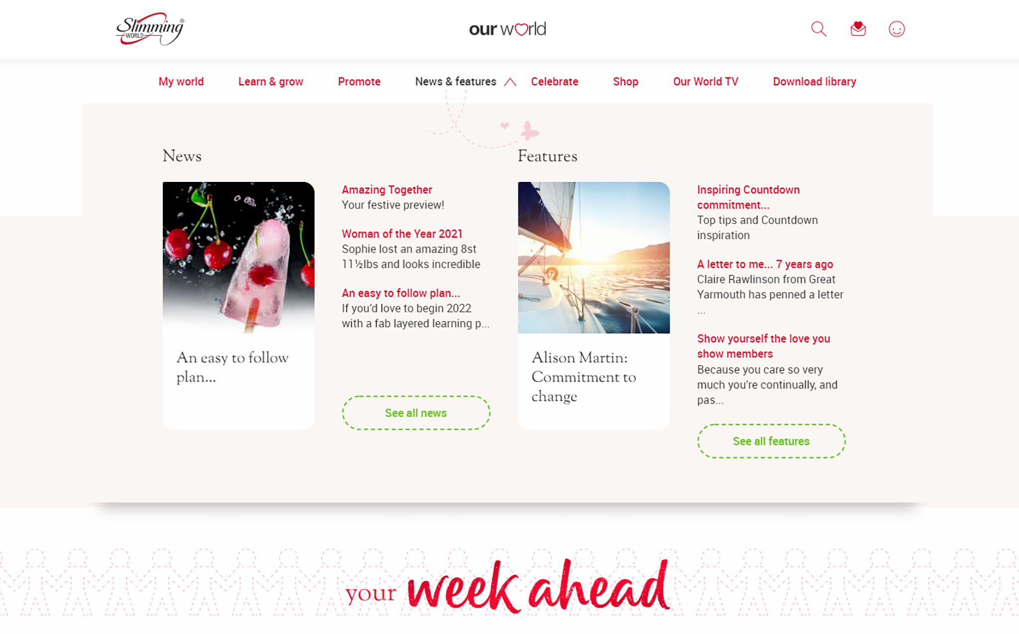
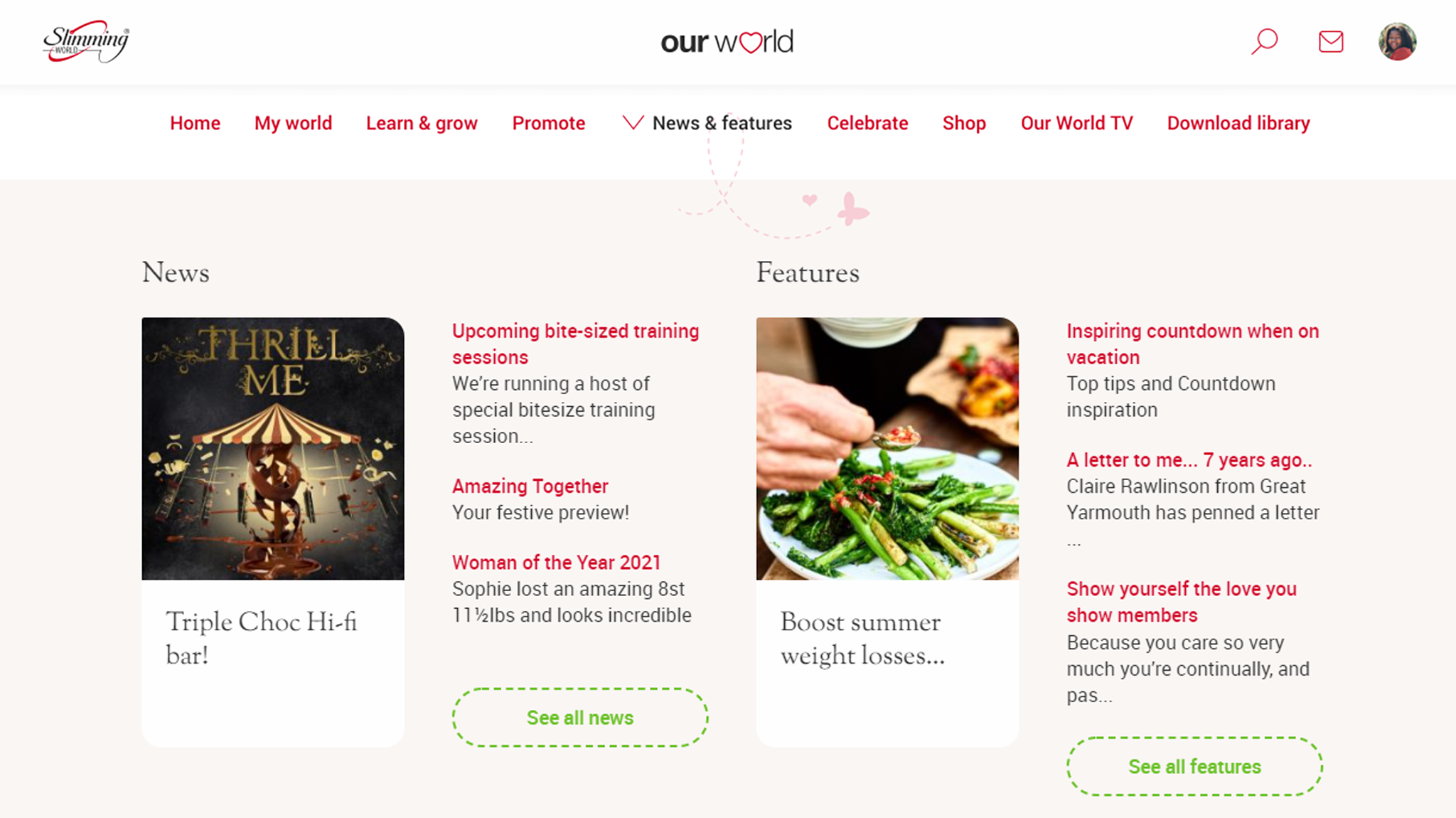
In contrast to our highly authorable menus, our "News and Features" menu was designed to automatically surface the latest content from those site sections – all with little to no author overhead.
If we look at the original decks from the design team, you’ll see slots for the "top" stories as well as "featured" sections for each:
When discussing how best to integrate this content with the frontend, we initially thought of simply querying for nodes as part of our FreeMarker template but instead opted for an API-first approach. This separation of concerns would afford us multiple benefits, including the ability to lazy load the content only when the user has chosen to interact with that particular menu.
As it happens, Magnolia already provides a robust delivery system for presenting JCR content as JSON – perfect for consumption in the frontend. However, our particular use case presented us with a unique challenge: our authors wanted the stories to appear in the menu in the same order as in Magnolia’s AdminCentral. This meant we couldn’t just use the queryNodes method of the delivery API since the orderBy directive sorts content by field values and not their JCR order. Omitting orderBy wasn't viable either since, as the documentation notes, this results in an unsorted list which is not necessarily in "natural order". We also investigated using the getChildren method of the delivery API which returns content in natural order but, unfortunately, loses the ability to query and limit results – a compromise we simply weren't comfortable making.
We were left at an impasse: we needed content in natural order but still wanted to apply our own queries and filters. Luckily, we found a handy Magnolia documentation page titled “How to get content as JSON – an overview” which lists several options:
the Delivery API that we’ve already discussed
the legacy nodes and property endpoints
custom Java endpoints
FreeMarker templates
The idea of using FreeMarker as an API provider had us intrigued; we could use a page template as a simple string generator and compose the braces, commas, and the double quotes of the JSON output ourselves. We would also have access to the standard rendering context objects and helpers which meant we could traverse the JCR, resolve DAM references, and, crucially, access and utilise query string parameters to affect the behaviour of the endpoint. This ultimately allowed us to define our own filter and order logic whilst maintaining the other aspects of the delivery API, such as result limiting. We could finally present the nodes in the natural order and meet the brief.
But we still needed to get our content loaded into the menu. We created a new “page” in an “endpoints” folder using our new JSON template which, when previewed, shows FreeMarker in action:
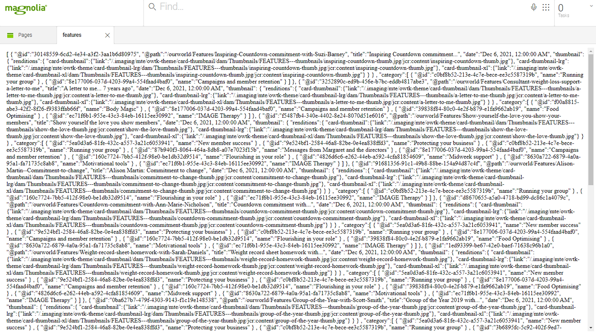
With this, we were able to call the endpoint from our frontend JavaScript using a simple fetch, and convert our initially inert <template> elements into living breathing DOM, complete with fully resolved thumbnail renditions. As for the featured content slot, we already had meta-data associated with articles to use as part of our landing pages for both Features and News, so were already part way there.
Magnolia stores these internal page references as string-based UUIDs, so all that remained was for us to resolve them. However, as there was no ordering requirement this time around we were able to use the Delivery API as-is and simply specify the JCR ID as a filter type.
Authors and developers: dreams in action
By combining the two approaches across our menus, authored content and dynamic data, we were able to achieve what our authors had asked for – a balance between control and flexibility with automatically up-to-date content where it made sense – without sacrificing the user experience by allowing them to concentrate on the task at hand using their familiar tools.
As developers, learning Magnolia for the first time, we had to explore our options as we went, consulting the documentation and collaborating with our brilliant team of authors and designers to help fulfil the vision of the new Our World.
We cannot wait to see where the project, and Magnolia, take us next.
